
Introduction
Choosing the right living room art is pivotal in setting the tone and ambiance of your home. Whether you lean towards vibrant abstract art, soothing organic art, timeless canvas art, or elegant ceramic art, the palette you select plays a crucial role in enhancing these pieces. A well-chosen scheme can transform your living space, creating a harmonious environment that reflects your personal style while showcasing your favourite artworks. This article delves into various palette inspirations tailored for different types of living room art, guiding you to create a visually stunning and cohesive space.

Why Colour Matters in Living Room Art
Colour is a fundamental element in both art and interior design, acting as a powerful tool to influence mood, perception, and the overall aesthetic of a room. When it comes to living room art, selecting the right palette is essential for several reasons:
Enhancing Art Forms: Different art forms, such as abstract art, organic art, canvas art, and ceramic art, respond uniquely to hues. A thoughtfully chosen scheme can highlight the intricacies of each type, making your living room art stand out.
Creating Ambiance: Shades evoke emotions. Warm tones like reds and oranges can create a cosy, inviting atmosphere, while cool tones like blues and greens promote relaxation and tranquillity. The right palette can set the desired mood for your living space.
Unifying Décor: A cohesive colour scheme ties together various elements of your living room, including furniture, rugs, curtains, and wall decor. It ensures that your living room art complements rather than clashes with the existing décor.
Highlighting Textures: Hues can accentuate the textures present in different art forms. For instance, earthy tones can enhance the natural textures in organic art, while bold shades can emphasise the dynamic shapes in abstract art.
Understanding art colour theory is essential in making informed decisions about palettes. By grasping the basics of warm and cool tones, complementary and monochromatic schemes, you can create a balanced and visually appealing environment that showcases your living room art effectively.

Breaking Down Four Art Forms and Their Ideal Palettes
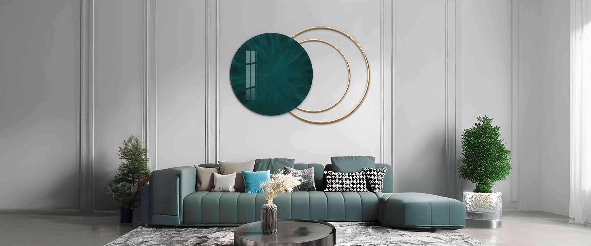
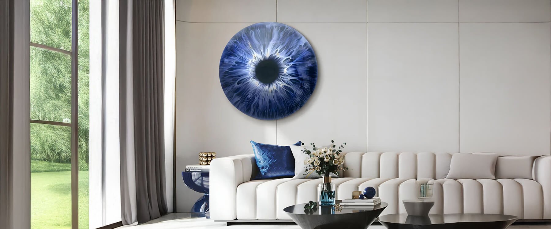
Abstract Art
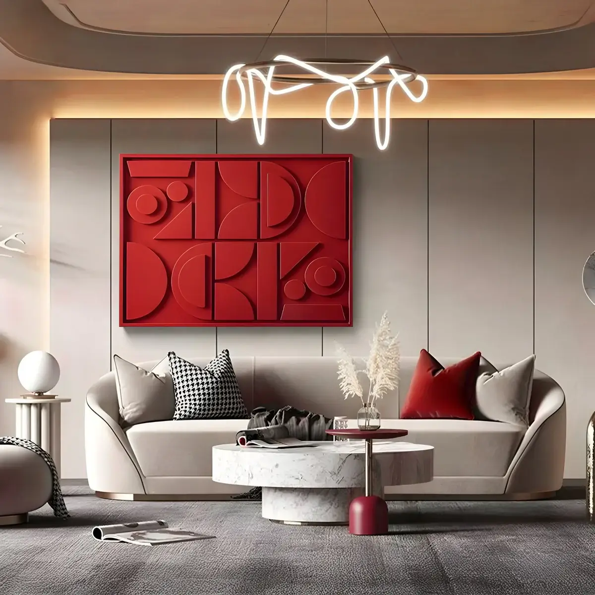
Abstract art is characterised by its use of shapes, colours, and forms to achieve its effect rather than depicting objects realistically. This type of art thrives on bold, dynamic palettes that can capture the viewer's attention and provoke thought.
Ideal Colour Palettes: Bold primaries like red, blue, and yellow create striking contrasts and vibrant energy. Geometric neutrals, including blacks, whites, and greys, provide a sophisticated backdrop that allows the abstract art to pop.
Interaction with Hues: Abstract art often features complex shapes and layers that interact with both vibrant and subdued tones. Bold shades can emphasise the dynamic movement and energy within the piece, while muted tones can highlight the intricacies and subtle details.
In a living room art setting, abstract art can serve as a statement piece, drawing the eye and becoming a focal point. When paired with a bold palette, it can energise the room, making it feel lively and engaging.

Organic Art
Organic art draws inspiration from natural forms and materials, often incorporating elements like wood, stone, and plant fibres. This art form benefits from palettes that echo the serenity and harmony found in nature.
Earthy Palettes: Greens, browns, and taupes complement the natural materials used in organic art. These tones create a calming and cohesive look that enhances the artwork's inherent tranquillity.
Soft Pastels: Gentle hues like soft pinks, light blues, and muted yellows can highlight the delicate textures and flowing lines typical of organic art. These shades add a touch of softness and elegance to the living room.
Incorporating organic art into your living room art collection can bring a sense of peace and balance. The right palette can amplify these effects, making your living space feel more connected to the natural world.
Canvas Art
Canvas art is versatile and timeless, making it a popular choice for living room art. This type of art can range from traditional landscapes and portraits to modern, abstract pieces, each benefiting from different palettes.
Traditional Palettes: Classic colour schemes with muted tones and soft contrasts enhance the timeless appeal of canvas art. These schemes work well with traditional and rustic living room art pieces.
Vibrant Colours: For more contemporary canvas art, vibrant and bold shades can make a significant impact. Bright reds, electric blues, and vivid yellows can add energy and modern flair to your living room.
Canvas art allows for extensive customization through colour, making it easy to match your living room's existing decor or to introduce new elements of hue and style. Whether you prefer a serene, monochromatic look or a vibrant, eclectic vibe, canvas art can adapt to fit your vision.

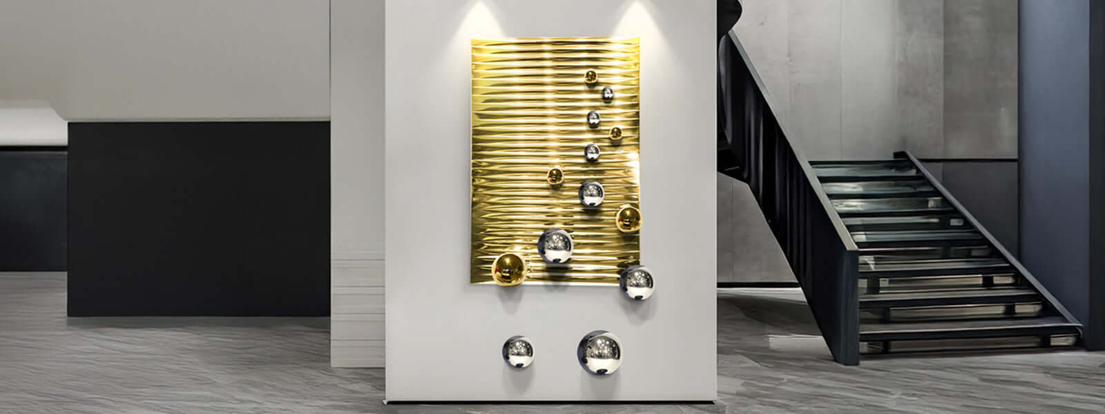
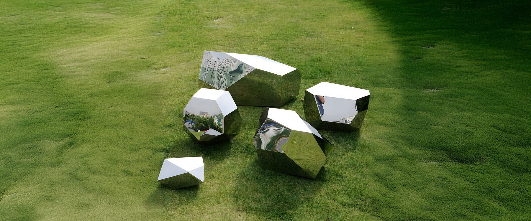
Ceramic Art
Ceramic art adds texture and dimension to your living room, often featuring glazed finishes and intricate patterns. This art form benefits from palettes that highlight its unique surface qualities.
Glazed Finishes: Shades that complement the glossy or matte finishes of ceramic art can enhance its visual appeal. Metallic tones, deep blues, and rich purples work well with glazed ceramics, emphasising their lustrous surfaces.
Pattern Accents: Patterns and hue contrasts in ceramic art can be accentuated with complementary or analogous schemes. These palettes help draw attention to the detailed craftsmanship of the pieces.
In a living room art arrangement, ceramic art can serve as both a functional and decorative element. The right palette can accentuate its artistic details, making it a standout feature in your living space.
Combining Multiple Art Forms
Mixing different types of art can create a dynamic and visually interesting living room. Combining abstract art with organic art, or pairing canvas art with ceramic art, can offer a balanced and eclectic look that reflects your personal style.
Colour Harmony: Ensure that the palettes of different art forms complement each other. For example, a bold abstract art piece can be balanced with a more subdued organic art in complementary tones.
Texture Balance: Combining various textures from canvas art, ceramic art, and organic art can add depth and interest to your living room art display. The interplay of smooth, glossy surfaces with rough, natural textures creates a tactile and visual richness.
Thematic Consistency: While mixing art forms, maintain a consistent theme or palette to ensure cohesion. This approach prevents the space from feeling chaotic and allows each piece to shine within the unified scheme.
By thoughtfully combining different art forms, you can create a living room that is both harmonious and visually stimulating, showcasing the versatility of living room art.
Creating Cohesion with Furnishings and Décor
To create a cohesive and harmonious living room, it's essential to integrate your living room art with the surrounding furnishings and decor. The palette of your artwork should either complement or contrast with the room's existing elements to create a balanced look.
Matching Hues: Select living room art that shares shades with your sofa, rugs, or curtains. This creates a seamless flow and ties the room together visually. For instance, if your sofa is a deep blue, choose canvas art with similar tones or complementary hues.
Contrasting Shades: Alternatively, use your living room art as a focal point by choosing pieces in hues that contrast with your existing decor. This method can make the art stand out and add visual interest. For example, a bright abstract art piece can pop against neutral walls and furniture.
Layering Textures: Incorporate different textures from your living room art into your decor. If you have textured organic art, use similar materials in throw pillows, rugs, or curtains to echo the artwork's tactile qualities.
Symmetry and Balance: Arrange your living room art in a way that balances the room's layout. Symmetrical placements can create a formal and orderly appearance, while asymmetrical arrangements add a more dynamic and relaxed feel.
By harmonising the palette of your living room art with your furnishings and decor, you create a unified and aesthetically pleasing environment that enhances the overall ambiance of your home.

Trending Colour Palettes for 2025
As we approach 2025, several colour trends are emerging in home design, influencing how we select and display living room art. Staying abreast of these trends can help you keep your space fresh and stylish.
Warm Neutrals: Shades like beige, taupe, and soft browns continue to dominate, offering a versatile and calming backdrop for living room art. These tones work well with both organic art and ceramic art, providing a subtle canvas that allows your artwork to shine.
Pastel Hues: Soft pastels such as blush pink, mint green, and sky blue are gaining popularity. These gentle shades are perfect for creating a serene atmosphere and are particularly suited for ceramic art pieces that feature delicate glazes and patterns.
Bold Jewel Tones: Rich shades like emerald green, sapphire blue, and ruby red are making a statement in living room art. These vibrant hues add depth and luxury, especially when paired with abstract art or canvas art that feature dynamic compositions.
Earthy Greens and Terracotta: Inspired by nature, earthy greens and terracotta tones are perfect for organic art. These hues create a grounded and harmonious environment, enhancing the natural elements present in your living room.
Monochromatic Schemes: Using varying shades of a single hue can create a sophisticated and cohesive look. Monochromatic palettes are versatile and can be applied to any art form, from abstract art to ceramic art, ensuring a unified aesthetic throughout the room.
Embracing these trending colour palettes can help you curate a living room that is both modern and timeless, ensuring your living room art remains a stunning centrepiece for years to come.

Common Pitfalls and How to Avoid Them
While selecting and displaying living room art can elevate your space, there are common mistakes to be mindful of. Avoiding these pitfalls ensures that your palette and art pieces harmonise effectively.
Overuse of Hue
Issue: Using too many bold shades can overwhelm the room and detract from the beauty of your living room art.
Solution: Limit your palette to a few dominant tones and use neutral shades to balance the space. This approach allows your abstract art or ceramic art to stand out without causing visual chaos.
Clashing Shades
Issue: Selecting hues that clash with each other can create a disjointed and unpleasant environment.
Solution: Use colour theory principles to choose harmonious combinations. For example, complementary colours (opposite each other on the colour wheel) can create striking contrasts without clashing, while analogous colours (next to each other) offer a more subdued and cohesive look.
Ignoring Scale
Issue: A large art piece can overwhelm a small space, while a small piece can get lost in a large room.
Solution: Measure your wall space and consider the scale of your living room art relative to the room's dimensions. For smaller rooms, opt for moderately sized or multiple smaller pieces. In larger spaces, a bold abstract art piece can serve as a stunning focal point.
Neglecting Texture
Issue: Focusing solely on hue without considering texture can result in a flat and uninteresting display.
Solution: Incorporate different textures through your art forms. Organic art with natural materials adds depth, while canvas art with layered brushstrokes or ceramic art with varied finishes can enhance the tactile experience of your living room art.
Overlooking Illumination
Issue: Poor lighting can diminish the impact of your living room art, making it appear dull or distorted.
Solution: Invest in quality illumination that highlights your art's hues and textures. Use a combination of ambient, accent, and task lighting to ensure your pieces are well-illuminated and visually appealing.
By being aware of these common pitfalls and implementing the suggested solutions, you can create a harmonious and visually stunning living room that showcases your art beautifully.

Conclusion
The right combination of shades can highlight the unique characteristics of each art form, create the desired mood, and harmonise with your room's decor. By understanding colour theory, exploring popular palettes, and avoiding common pitfalls, you can curate a living room that is both stylish and inviting.
Encourage yourself to experiment with various hue combinations and art mediums to discover what resonates best with your personal taste and living space. Whether you consult local galleries, explore online resources, or try your hand at creating custom pieces, embracing the possibilities of hue and art will transform your living room into a vibrant and cohesive haven. Invest in quality living room art, thoughtfully paired with a harmonious palette, and watch as your space becomes a true reflection of your artistic vision and design sensibilities.