
Decorating your home isn’t just about choosing furniture - it’s about creating a harmonious space that reflects your personality. One of the most effective ways to achieve this balance is by matching your three-dimensional artwork with your room’s colour scheme. In today’s post, we’ll explain why this alignment is crucial for a cohesive interior design and share practical tips for integrating these eye-catching pieces into your décor. Whether you’re drawn to bold modern art or subtle abstract designs, understanding the interplay between 3D art and colour can transform your room into a dynamic, visually engaging space.

Understanding 3D Art and Colour Theory
Before you start selecting pieces for your living space, it’s important to grasp what constitutes three-dimensional artwork and how colour theory influences the ambience of a room.
What is 3D Art?
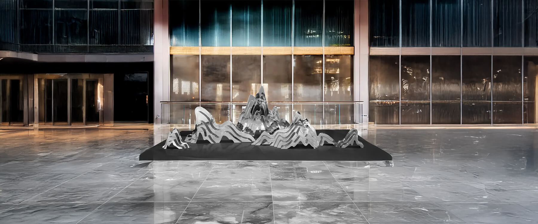
3D art refers to any artwork that has depth as well as height and width. Unlike traditional two-dimensional paintings, it encompasses sculptures, layered prints, and installations that pop out of the wall or the floor. These pieces often offer a tactile experience, engaging not only your eyes but also inviting you to consider texture and form. Whether you’re admiring a modern, abstract art or a detailed 3D painting, these artworks are designed to add dimension and interest to your living space.
Different types of 3D artworks can serve various purposes. For instance, a metal sculpture might act as a striking accent wall, while a series of layered prints can create a gallery-like feel. The beauty of these artworks lies in its versatility, its ability to be the centrepiece or blend seamlessly into the background, depending on how you style your room.

The Basics of Colour Theory for Interiors
Colour theory is the backbone of interior design, guiding how different hues interact within a space. In its simplest form, colours are divided into primary, secondary, and tertiary groups. Primary colours (red, blue, yellow) mix to form secondary colours (green, orange, purple), and these can be further blended into tertiary shades.
In any room, colour harmony is key. Complementary colours (those opposite each other on the colour wheel) can create vibrant contrasts, while analogous colours (those next to each other) produce a more unified, calming effect. When it comes to art, especially 3D art, understanding these relationships helps you decide whether you want your artwork to blend in with your room’s existing palette or stand out as a bold statement.
Lighting and material finishes also affect how colours appear. A piece of 3D artwork in natural light might look entirely different under warm artificial lighting. This is why it’s crucial to consider both the artwork and the room together ensuring that your chosen piece works well with the overall ambience and lighting conditions of your home.

Practical Tips for Matching Your 3D Art with Your Room’s Colour Scheme
Now that we have a basic understanding of 3D art and colour theory, let’s move on to practical tips for matching your artwork to your room’s colour scheme. These strategies will help you create a balanced, engaging space where both the art and the interior design shine.
Assess Your Room’s Current Colour Palette
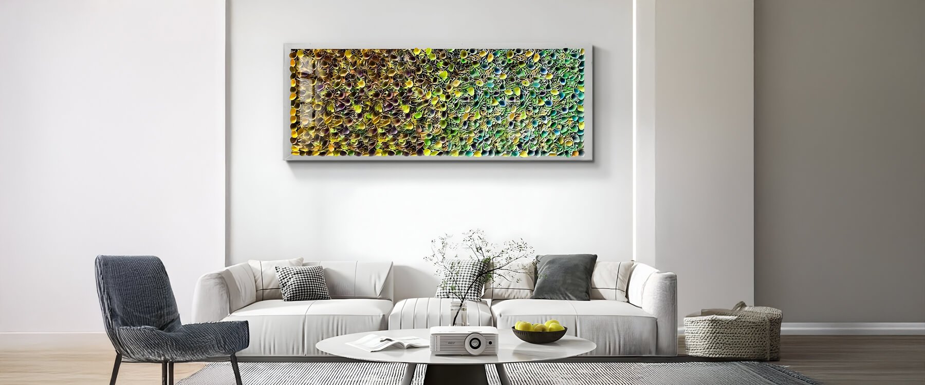
The first step is to evaluate your room’s existing colours. Look at the walls, furniture, and decorative accents to determine your dominant and accent colours. Tools like colour swatches or digital apps can help you accurately identify these hues. Once you have a clear idea of your room’s palette, decide whether you want your 3D art to complement the existing scheme or provide a contrasting pop. For example, if your living room features warm, earthy tones, you might choose artwork with cool blues or greens to create an engaging balance.
Choosing the Right 3D Art to Complement or Contrast
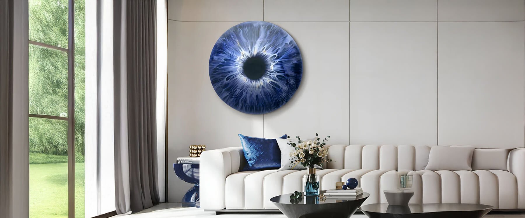
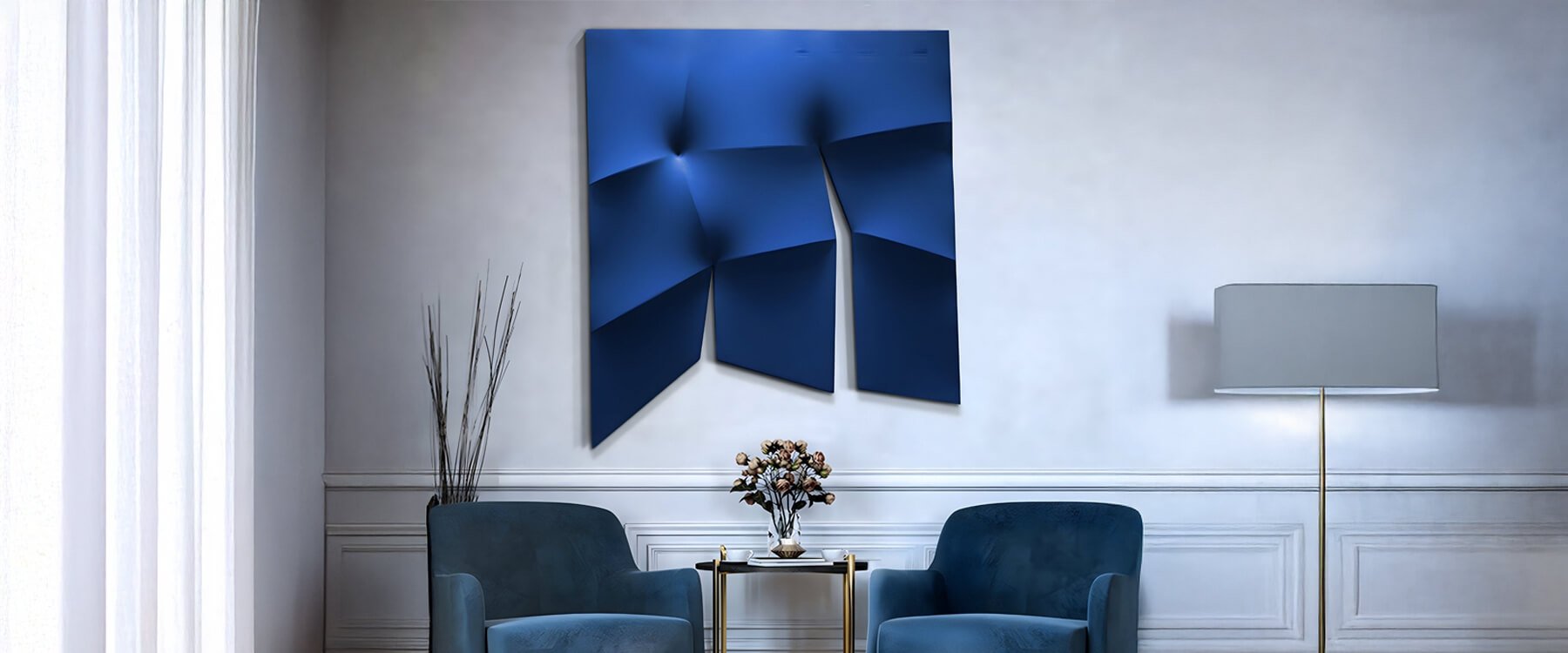
When it comes to picking your piece, think about how it will interact with your room’s colours. If you’re after a seamless look, choose artworks that echo your room’s dominant hues. Alternatively, if you want a focal point that pops, opt for a piece with contrasting colours. For example, a vibrant piece with splashes of red or blue can serve as an accent wall against a largely neutral background.
Remember, the texture and finish of your artwork are just as important as its colour. A rough, tactile surface can add an interesting dynamic, especially when paired with smooth, modern furnishings. The key is to strike a balance between making a statement and maintaining visual harmony throughout the space.

Considering Lighting and Placement
Lighting can transform how both your room and artwork are perceived. Natural light can bring out the true colours of your piece, while carefully placed accent lights can highlight intricate details. If your room has large windows, consider how direct sunlight might affect the artwork over time. In rooms with limited natural light, installing adjustable lighting can help create the right ambience and ensure that the artwork’s colours remain vibrant and balanced.
Placement is equally important. For maximum impact, hang your artwork where it naturally draws the eye, this might be above a sofa, over a fireplace, or as a centrepiece on an accent wall. By positioning your artwork in a well-lit area that complements your room’s colour scheme, you enhance both the piece and the overall décor.
Real-Life Examples and FAQs
Real-Life Examples
To illustrate these tips, consider a living room with a predominantly neutral colour scheme accented by pops of blue. By choosing a piece of 3D art with deep blues and complementary shades, the artwork can tie the room together and serve as a striking accent wall. In another scenario, a room with bold, vibrant furniture might benefit from a subtler 3D piece that enhances rather than competes with the existing décor.

FAQs
Q: How do I choose the right colours for my 3D art?
A: Start by analysing your room’s current palette. Decide whether you want your art to complement the existing colours or provide a contrasting accent, and select a piece that fits that vision.
Q: What lighting works best for showcasing 3D paintings?
A: A combination of natural light and accent lighting works well. Use spotlights or track lighting to highlight the artwork’s details, and adjust window treatments to prevent harsh glare.
Q: Can I mix different types of 3D artwork in one room?
A: Yes, as long as there is a cohesive colour theme and balance in texture and scale, mixing various styles can add interest and depth to your space.
Conclusion: Create a Cohesive Look with 3D Art
Matching your three-dimensional artwork with your room’s colour scheme can transform your space into a well-curated haven that truly reflects your personal style. By assessing your room’s existing palette, carefully selecting art that complements or contrasts those colours, and considering the impact of lighting, you can create a balanced and dynamic environment. Whether you’re drawn to bold abstracts, serene landscapes, or innovative sculptures, these tips will help you integrate your artwork seamlessly into your home interior design.
If you’re ready to take your space to the next level, explore our resources on home interior design and art placement. For a curated selection of standout pieces, check out Giant Sculptures' 3D art collection for further inspiration. And remember, your perfect piece is waiting to add that extra spark to your room, start exploring today and watch your space come alive with personality and style.